The plunge in labor force participation since the great recession in 2008 has led many to rightly question how well the unemployment rate -- the percent of the labor force that has looked for work in the last 4 weeks -- measures the true level of "slack" in the labor market.
Much (most) of the decline in labor force participation can be explained by the retirement of baby boomers, the oldest of which turned 65 in 2010, and by people between the ages of 16 and 24 choosing to focus on education instead of working.
 The decline in labor force participation among young people is something that was occurring before the great recession. Even though it the recession seems to have sped up the decline, I'm pretty certain that most of the people between 16 and 24 who left the labor force in 2008 and 2009 or simply haven't joined since then (I'm in that group) wouldn't rejoin even if there was no slack in the labor market.
While the labor force participation rate for Americans 55 and older didn't actually decline in the great recession, it stopped a decades-long trend upward and has flattened out since then.
 The fact that the participation rate for older Americans has settled at a lower level than participation for the general public, and that the share of the civilian noninstitutional population (basically everyone above the age of 16 who isn't deployed in the military or in prison) that is older than 55 years is increasing, has put significant downward pressure on the total labor force participation rate.
 That being said, it's hard to be certain whether or not the recession has had lasting cyclical impacts on labor force participation, which warrants using statistics other than the unemployment rate to gauge the strength of the labor market.
One such popular measure is the broadest measure of underemployment put out by the Bureau of Labor Statistics (BLS) -- total unemployed, plus all marginally attached workers plus total employed part time for economic reasons -- or the U-6 unemployment rate.
 I don't really like this as a measure of labor market strength though, because it doesn't count people who retired earlier than they wanted to as a result of the recession, people are only counted as "marginally attached" if they have searched for work in the last 12 months, and part time workers aren't really unemployed (there is an alternative measure that excludes involuntary part time workers but it still has the problems I mentioned above).
Some people like to look at the employment rate for the so called "prime age" population who are between the ages of 25 and 54 (I don't know why the cutoff is 54, going up to 65 makes way more sense to me) in order to weed out the effects of aging and lower youth participation on the labor market.
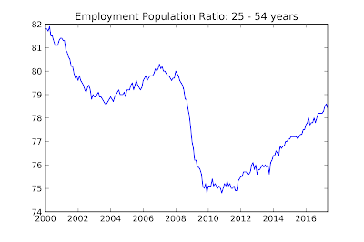 This is a relatively good solution for the years after 1990, and it does show that the labor market is considerably weaker than the unemployment suggests (although not so weak that we need to "prime the pump"), but it has trouble before 1990 because women were still joining the labor force en masse for most of the latter half of the 20th century.
Basically every statistic that you can easily get from BLS data has a problem like this, so it's really hard to get a good measure of how healthy the labor market is, but there is a solution. The Congressional Budget Office (CBO) looks at the demographic composition of the working age population and comes up with what it thinks the labor force participation rate would be at full employment. It calls this measure the "potential labor force", which tries to estimate the movement in labor force participation caused by gender and aging and can then be used to estimate the cyclical component of labor force participation.
 It is then possible to find the "adjusted" unemployment rate with the CBO's estimate of the potential labor force. The above chart shows the actual unemployment rate reported by the BLS as well as my calculation of the adjusted unemployment rate using the potential labor force from the CBO's 2007 and 2017 data for "Potential GDP and Underlying Inputs" (all CBO data is available here). The dashed grey line is the natural rate of unemployment -- that is the unemployment rate that is consistent with full employment -- according to the CBO.
Since I was only able to find annual "potential labor force" figures, the estimates only extend to 2016, but both the 2007 and 2017 figures are broadly consistent with the prime age employment rate: the unemployment rate overstates the health of the labor market by between 1 and 2 percent (depending if you use the 2007 or 2017 value for the potential labor force). This is similar to where we were in 2003 or 1994, so while there's no real cause to worry about joblessness right now the recovery isn't completely over yet either. As a side note, tax cuts are even more of a stupid idea now than they were in 2003, but that issue deserves a whole post of its own.
Much (most) of the decline in labor force participation can be explained by the retirement of baby boomers, the oldest of which turned 65 in 2010, and by people between the ages of 16 and 24 choosing to focus on education instead of working.

While the labor force participation rate for Americans 55 and older didn't actually decline in the great recession, it stopped a decades-long trend upward and has flattened out since then.


One such popular measure is the broadest measure of underemployment put out by the Bureau of Labor Statistics (BLS) -- total unemployed, plus all marginally attached workers plus total employed part time for economic reasons -- or the U-6 unemployment rate.

Some people like to look at the employment rate for the so called "prime age" population who are between the ages of 25 and 54 (I don't know why the cutoff is 54, going up to 65 makes way more sense to me) in order to weed out the effects of aging and lower youth participation on the labor market.

Basically every statistic that you can easily get from BLS data has a problem like this, so it's really hard to get a good measure of how healthy the labor market is, but there is a solution. The Congressional Budget Office (CBO) looks at the demographic composition of the working age population and comes up with what it thinks the labor force participation rate would be at full employment. It calls this measure the "potential labor force", which tries to estimate the movement in labor force participation caused by gender and aging and can then be used to estimate the cyclical component of labor force participation.

Since I was only able to find annual "potential labor force" figures, the estimates only extend to 2016, but both the 2007 and 2017 figures are broadly consistent with the prime age employment rate: the unemployment rate overstates the health of the labor market by between 1 and 2 percent (depending if you use the 2007 or 2017 value for the potential labor force). This is similar to where we were in 2003 or 1994, so while there's no real cause to worry about joblessness right now the recovery isn't completely over yet either. As a side note, tax cuts are even more of a stupid idea now than they were in 2003, but that issue deserves a whole post of its own.


No comments:
Post a Comment